I’d love your input for Book 2, Lured By Light, which I’ve started finalizing for publication — Fall 2020!
Which one of these 6 covers do you like the best? They are all similar… One image has choices #1-#3 and the other has #4-#6.
Thanks!
The book description for Lured By Light
At Bijoux de L’Etoile, the high-end casino orbiting Earth, anything can—and does—happen in 2130.
It’s a quiet day for L’Etoile lead investigator, Janey McCallister, until a young woman runs screaming through the casino. She looks like a victim of abuse, but when her boyfriend turns up dead the next day, she becomes the prime suspect.
Determined to investigate every angle, Janey searches for clues and uncovers a world of high-priced escorts and human trafficking—a world just like the one that took the life of her best friend long ago. Now the case is personal.
When Orlando Valdez, inspector for Sol Unified Planets, shows up with a new suspect, Janey isn’t sure she can trust the mercurial man who stopped returning her calls. But as the threats escalate and she unravels a deeper conspiracy, Janey and her team will need all the help they can get. If they fail, it could be the end of everyone on L’Étoile.
Janey McCallister Mystery series
Into The Black (Book 1)
Lured By Light (Book 2) (preorder coming soon!)
Gone Green (Book 3)
Red Running Deep (Book 4)
Into The Black on pre-order: https://books2read.com/intotheblackbarany
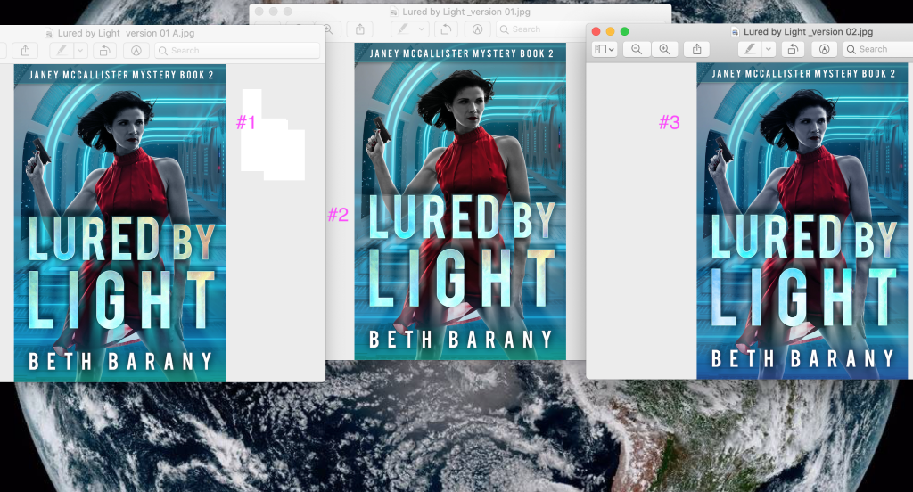
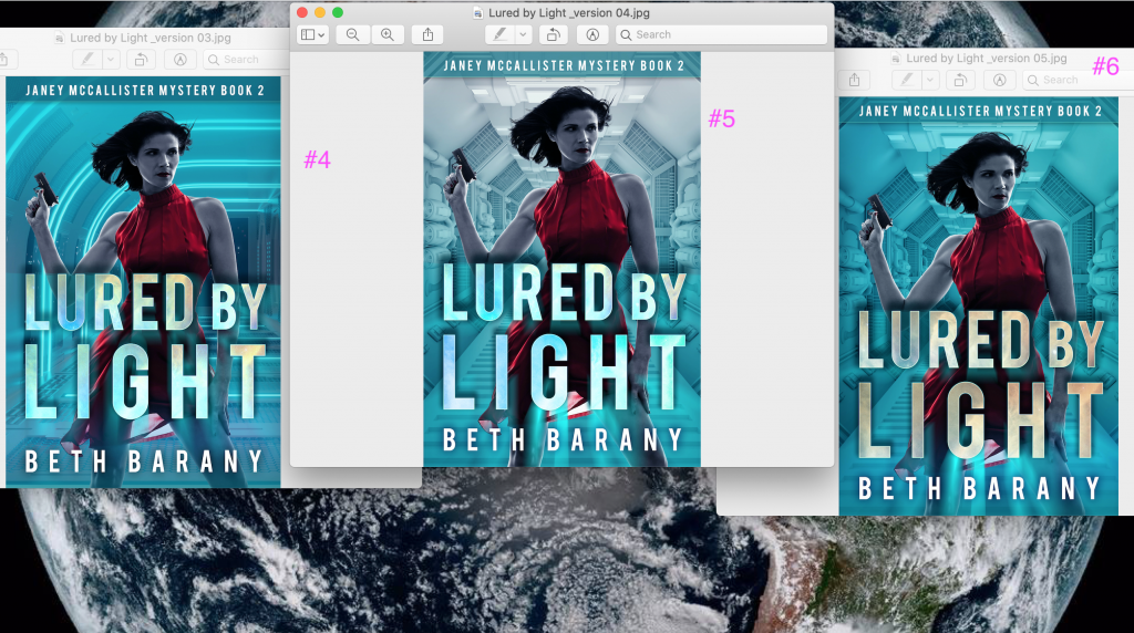
VOTE!
Post the one you like the most below in the comments: Thanks so much!
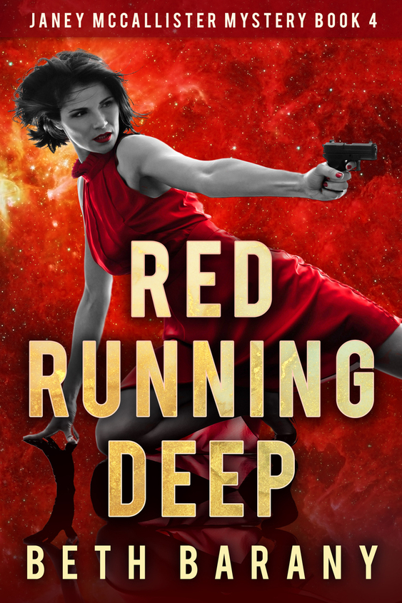

Book 6
number5 the light awbove goes with t6itle
Thanks, Betty! Good point!
Thanks, Marcia!
5 or 6 really grab my attention! Great covers!
Thanks, Melissa!
#5 I like the way the overhead light is different.
6–good contrasts, her face isn’t kind of washed out by the lights like in 5. And her face seemed to read better than in 4 as well.
1-3, I lose the gun in the background color
They’re all cool in their own ways, so I called out what made 6 stand out for me.
Happy choosing!
Thanks Shari! Love your input!
5
Thanks, Diane! Much appreciated!
#2
I like the background used in 1-4 because it fits the ‘casino in space’ setting. Out of those four I like the lighting best in #2 . Hope that helps! 🙂
It does help. Thanks, Laura!
I like cover #5.
Thanks, Diana!
cover 6
Thanks, Maria!
I like number 5 🙂
Thanks, Meisha!