I’d love your help!
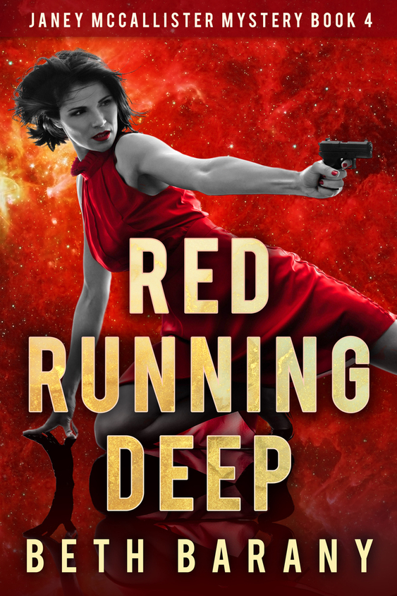
Which version of Book 4 cover do you like the most and why?
Only the lettering of the title is what’s different.
Choose between v.03, v.04, or v.05.
At the vendors https://books2read.com/redrunningdeep, I currently have loaded v.03 but realized I needed something more for the lettering. So my cover designer has mocked up a few more options.
For comparison, the second row is the first 3 books in the Janey McCallister Mystery series. All of those books are currently available, while Book 4 is due out Nov. 2021, and is on preorder now.

Comments Please!
Post in the comments which of the cover versions of RED RUNNING DEEP (the red covers) you like the best. And you’ll help me create an awesome cover.
Thanks so much!
HANDY LINKS
Red Running Deep, Book 4 in the Janey McCallister series — on preorder here: https://books2read.com/redrunningdeep
Gone Green, Book 3: https://author.bethbarany.com/gone-green/
Lured By Light, Book 2: https://author.bethbarany.com/lured-by-light/
Into The Black, Book 1: https://author.bethbarany.com/into-the-black-2/

I really love the text on v.03. It’s clear and crisp and really stands out. I’m sorry it’s not the red text, but that sort of disappears.
Carol M
I think 04, it matches the letter color scheme with the previous three books.
Ditto!!!!!!
I love the v.05 the best. Love all the covers but loved v.05.
So do I!
Red running deep are all the same! How could one be picked over the other. But i love them. The flaming background grabs the eye. Invokes a tension as i do not know if she is diving for cover as she aims or kicking at an opponent.
Into the black cover shows her ready for action but it is out of focus. Gone Green she seems cocky and totally in control. Lured by the light I love her expression, so focused but the angle a which she holds the gun seems off. But all 4 covers convey a strong woman ready to battle
I like #5 the best. The color of the font blends the best and doesn’t distract from the rest of the cover.
I like the first and second, for some reason I have trouble focusing on the third choice.
I prefer the v 05.
I like v5 the best. The color seems stronger.
I love the yellow font the best as it grabs your attention from other books. The first book stood out to my partally color blind eyes which has difficulty with red
I liked 05 but, after reading that some color blind readers couldn’t make out the letters, I may have to go with the first one.
I like the v.05. The dark lettering really grabs my attention and it goes well with the title.
I like the first one
v.03
Vo5 with the RED letters.
For sure v.03. The lettering pops more and isn’t washed out by the rest of the red.
v03
Version 3 is my favorite. The type really catches the eye and draws you in. Additionally, it matches the other books’ styling best.
v03 — the text stands out better.
I think 03 fits the typographic feel of the first 3 books, but the one that calls to me, and FEELS like mystery, is 05. That intensification of color grabs me. My eyes go “face” – “gun” – “title,” flowing naturally. In 03, when my eyes go face/gun/title, the harshness of the yellow jolts me.
Thanks everyone! I’ll compile these and send them to my designer.
Red Running Deep v4 gets my vote. The letters almost disappear on v5 and stand out too boldly in v3. I’m sure with any cover you choose the story will keep the audience spellbound.
Thanks, Wynnie! I think I went with v.03.