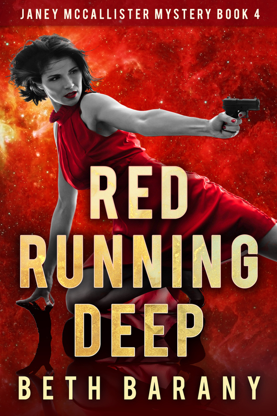
Please let me know in the comments you favorite of these two choices. This is my final round for deciding the cover for Gone Green, Book 3, in the Janey McCallister Mystery series.
The only change is the look — the colors — of the title.
If you haven’t already, you can preorder the e-book from the online vendors here: https://books2read.com/gonegreen.
VOTE FOR YOUR FAVORITE


number 2, looks much better
Definitely #2. Title pops more.
Cover two. YOU CAN SEE HER EYES BETTER. (SORRY MY CAT IS HELPING ME TYPE AND KEEPS HOLDING DOWN THE SHIFT KEY.)
LOL High kitty!
Number 2 caught my eye more.
I like version 2 because the headline of the book stands out more. In version 1, the headline blends into the cover too much, not enough contrast.
Thanks, Sunny!
I like version 2 the best, it pops better.
Version #2 pops more – it definitely gets one’s attention.
Number 3 Beth.
LOL
Number 2 – eyes are too dark in #1
I actually like #1 better. The text of the title is more inline with the other books… lighter and the shading stands out more.
Good point!
version 2
Version 2
I definitely prefer version 2, because it makes the title pop.
Good luck with your decision!
Debbie
Thanks, Debbie!
Number two really catches the eye.
I like version #2. It’s visually more eye catching.
Number 2
Version 2. It pops
Version #2 is greener (as per title) and bolder (as Janey). I love the sexy little flip of the red skirt teasing with a little leg. Good luck, Beth!
Thanks, Aimee!
I like version 2
Thanks so much everyone for your votes and detailed replies. I’ll work with my designer to make a final version. Your input helps so much as both of these covers looked good to me!